
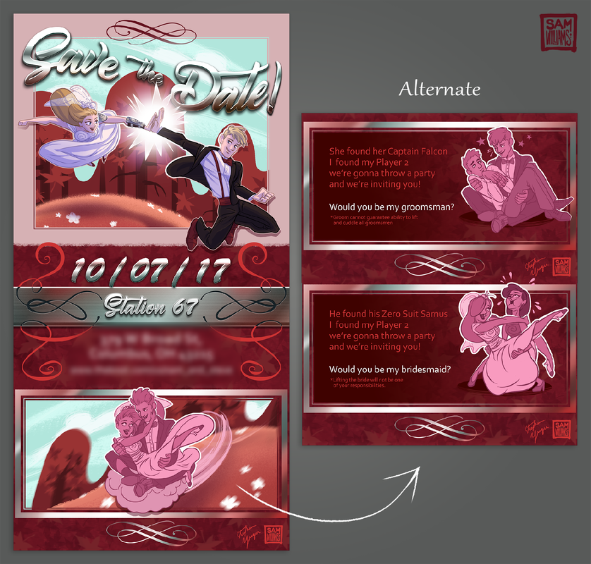
I included alternate end slates for bridesmaids and groomsmen to seamlessly invite them to join the wedding party while also giving them the basic info.
Design note: I organized the RSVP for clear understanding of info, but did not realize until too late that with this design I couldn't separate family groups because I gave them no way to mark whose meal was whose. Would redesign in the future with this data.
|

|
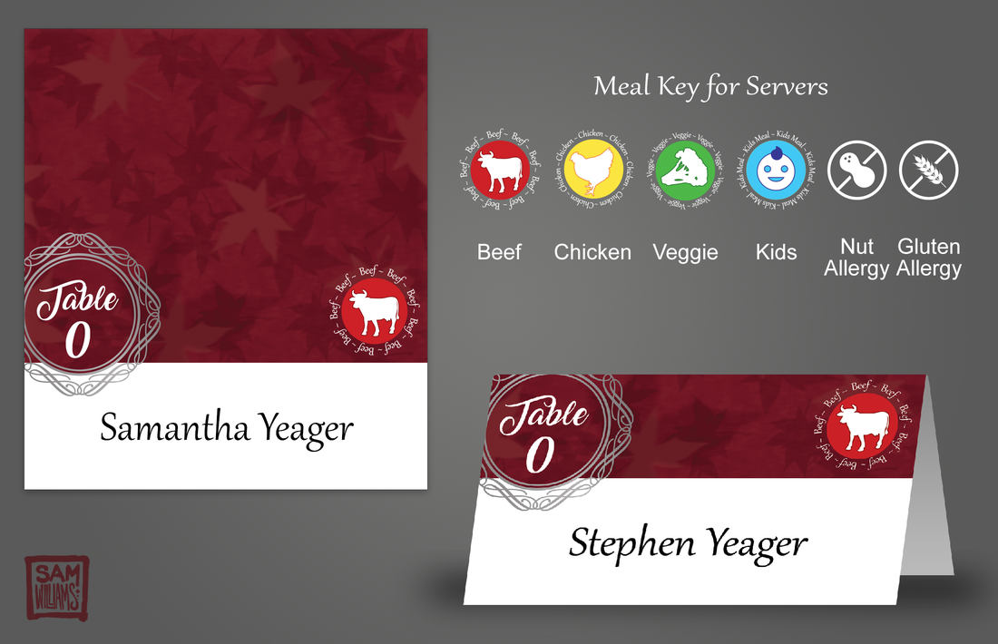
I included a key of symbols for the wait staff to make serving straightforward. Symbols used both color and shapes for easy recognition. Place cards were presented in a pile so guests could decide how to seat themselves at their tables.
|
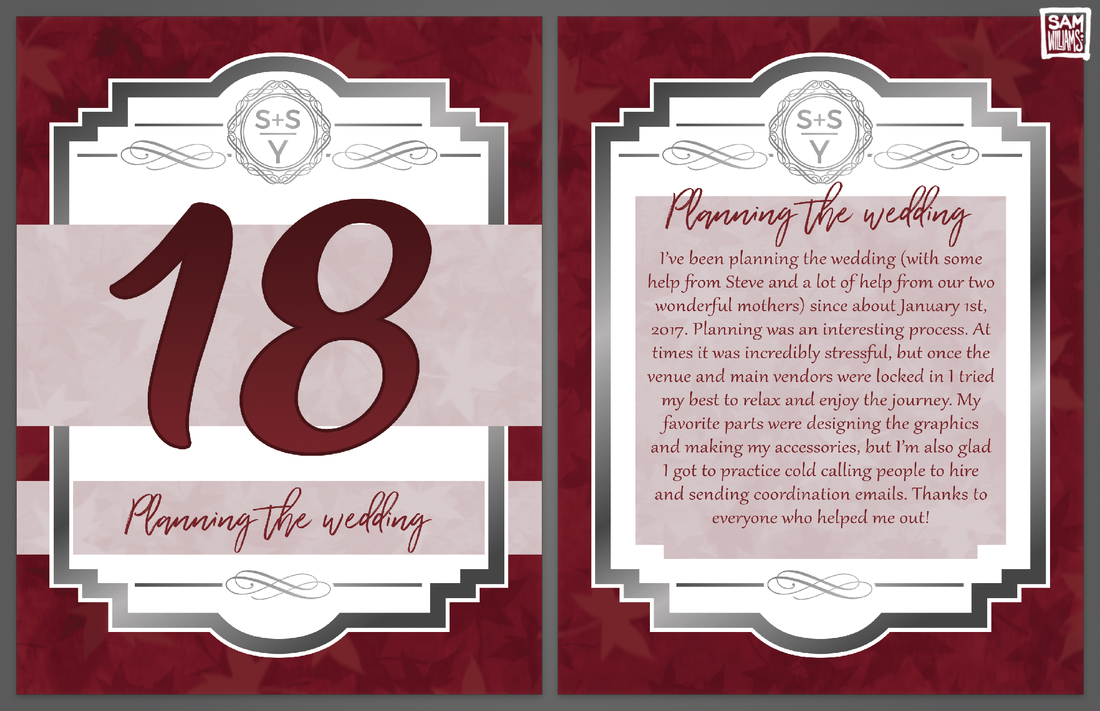
I included a story on the back of each card for delight of the guests. Looking at each table number would take you through our entire love story, something I hoped would encourage guests to mingle after dinner.
|
Overview
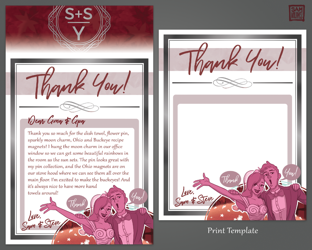
I was unemployed when my now-husband Steve proposed to me. After we began planning the wedding and saw how much work it would be, I decided to take time off to devote to the task. Over several months, I designed the look and feel of our wedding, focusing on digital and physical cards and signs that conveyed information to the vendors and guests. For the printed cards, I used Vista Print and Staples templates and printing services. I treated every piece of the suite as an opportunity to tie in the wedding's colors, shape language, logo, and build the vintage fall theme.
Role
I was the designer and single point of contact for all information about our wedding to both guests and vendors.
Challenges/Successes
Designing our RSVP proved challenging. I focused on keeping like-information together and large enough on the small card that guests could comfortably write their responses. I also wanted our cards to work for families with children, providing a large, unbroken space for multiple names instead of just two lines for the name of the guest and their plus one. Unfortunately, I overlooked the fact that my design didn't allow guests to easily mark which meal was for whom, and only realized the problem after we started receiving the RSVPs in the mail. This meant that unless the guest also caught onto the problem and explained who got what meal on the back of the card, I only knew what meals were for what family group rather than for each individual. I ended up solving this problem by seating family groups at tables together so that if we guessed the wrong meal for one member, they could easily trade with the others. If I were to design another RSVP card, I would make sure not to repeat this mistake.
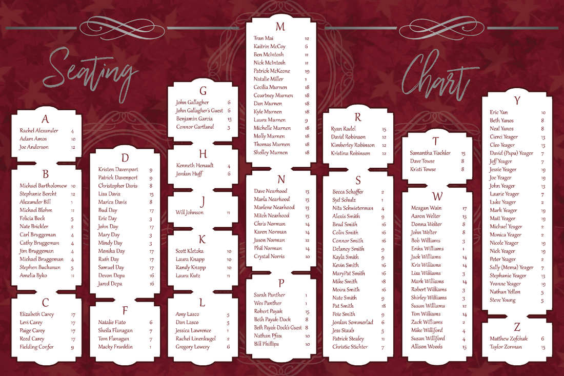
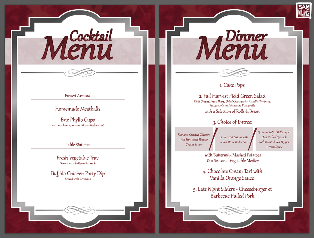
I succeeded in making all other information abundantly clear for our guests, using my attention to detail and repetition. I emailed guests often with important information, treating them like clients. I made not-strictly-necessary print assets, specifically the cocktail and dinner menus, using information I'd gathered as a past wedding guest. The menus let guests know what was being served without having to chase down waiters, and built excitement over later dinner courses. I also organized our seating chart alphabetically, instead of by table. This design may not be as pinterest-worthy as some of the examples I saw while I was gathering reference, but it makes it easier for the guests to find themselves in the list. My work paid off, and I received several compliments after the wedding about how straightforward the important information had been.
I succeeded in making all other information abundantly clear for our guests, using my attention to detail and repetition. I emailed guests often with important information, treating them like clients. I made not-strictly-necessary print assets, specifically the cocktail and dinner menus, using information I'd gathered as a past wedding guest. The menus let guests know what was being served without having to chase down waiters, and built excitement over later dinner courses. I also organized our seating chart alphabetically, instead of by table. This design may not be as pinterest-worthy as some of the examples I saw while I was gathering reference, but it makes it easier for the guests to find themselves in the list. My work paid off, and I received several compliments after the wedding about how straightforward the important information had been.
